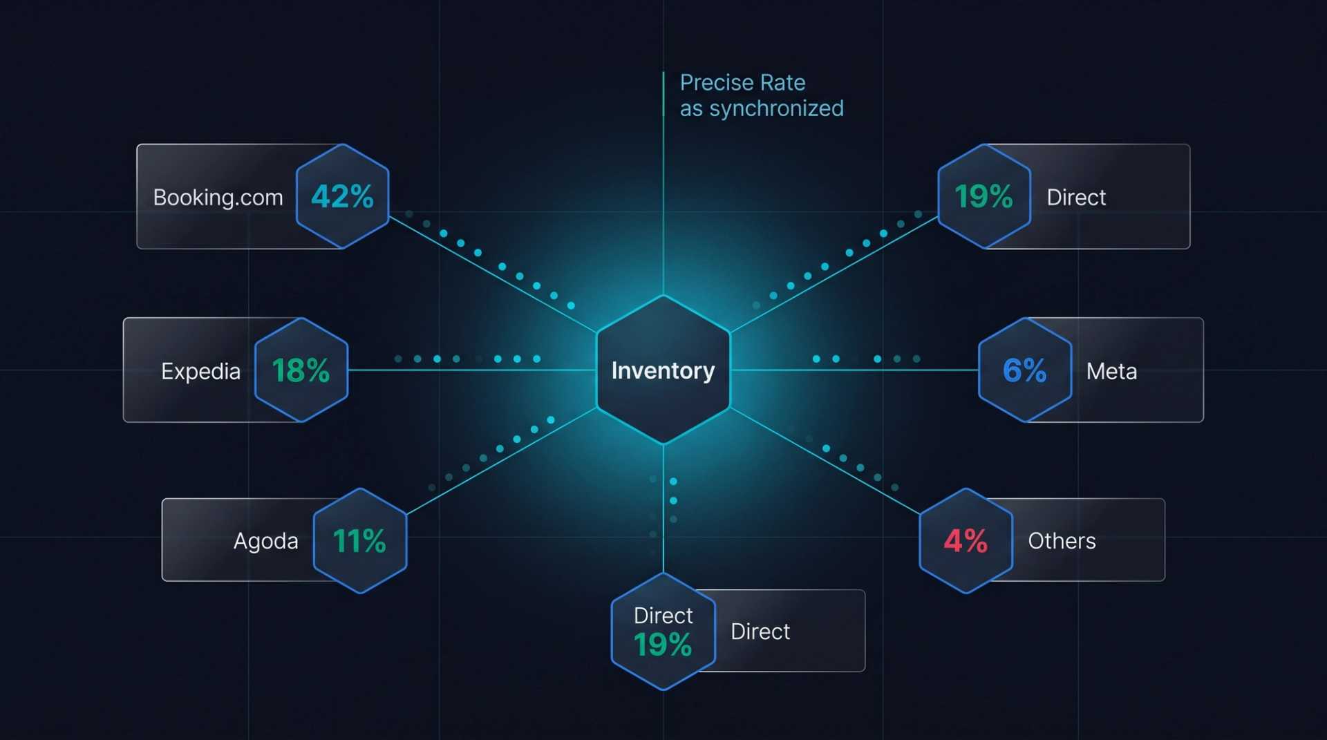
![Maximize Hotel Direct Bookings: UX Optimization [2026 Guide]](https://cdn.sanity.io/images/1la98t0z/production/183d015eb7bcbd128d52e4df0729d05418e3c34f-2048x2048.png?w=1920&q=65&auto=format&fit=max)
Key Takeaways
- UX Drives Direct Bookings: 94% of visitors judge credibility by design in 50ms, and UX optimization can increase direct bookings by 35-50%, significantly boosting ROI by reducing OTA commissions.
- Mobile-First is Mandatory: With 72% of hotel traffic from mobile, prioritizing touch-friendly elements, one-hand usability, sticky booking bars, and fast load times (under 2 seconds) is crucial to close the mobile conversion gap.
- Streamlined Navigation & Booking: Users seek room/rates, location/contact, photos/reviews. Ensure a 3-click rule for information, simple menus, breadcrumb navigation, and a concise booking form with minimal fields and visual calendars to reduce abandonment.
- Emotional Connection & Trust: High-quality visuals, clear visual hierarchy, ample whitespace, and strategic color psychology create a luxurious and trustworthy perception. Social proof (reviews, awards) increases booking completion by 270%.
- Technical Performance is Non-Negotiable: Meeting Core Web Vitals (LCP < 2.5s, FID < 100ms, CLS < 0.1), optimizing images (WebP, lazy loading), and implementing chatbots significantly improve UX. A/B testing is essential for data-driven improvements.
Why UX Design is Key to Direct Bookings
94% of visitors to a hotel website decide on its credibility based on site design, a decision made within the first 50 milliseconds. According to Google's hospitality industry research, websites with poor UX design have bounce rates exceeding 65% — meaning 65 out of every 100 visitors leave without clicking on any page.
In contrast, UX-optimized hotel websites increase direct booking rates by 35-50%. When every direct booking translates to savings on OTA commissions (15-25%), the ROI of a UX investment reaches astronomical levels.
So, where should you start to perfect the user experience on your hotel website?
Embed this image on your site
<a href="https://otelciro.com/en/news/maximize-hotel-direct-bookings-ux-optimization-2026-guide">
  <img src="https://cdn.sanity.io/images/1la98t0z/production/183d015eb7bcbd128d52e4df0729d05418e3c34f-2048x2048.png" alt="Hotel Website UX User Experience Infographic" width="800" />
</a>
<p>Source: <a href="https://otelciro.com">OtelCiro</a> — AI Hotel Revenue Management</p>
Related reading: Booking Engine and Direct Bookings
Mobile-First Design: A Necessity, Not an Option
72% of hotel website traffic comes from mobile devices. However, the mobile conversion rate is still 50% lower compared to desktop. This gap is a direct result of poor mobile UX design.
Touch-friendly elements: Buttons should be a minimum of 48x48 pixels, with at least 8 pixels between them. Trying to tap small buttons is a major source of user frustration.
One-hand usability: 75% of mobile users hold their phone with one hand. Place critical CTA buttons (book now, see prices) in the bottom half of the screen, easily reachable by the thumb.
Sticky booking bar: A sticky bar that remains fixed when scrolling, featuring date and price information along with a "Book Now" button, increases mobile conversion rates by 27%.
Use hamburger menus carefully: Hiding primary navigation in a hamburger menu reduces discoverability. Keep the 3-4 most important links (Rooms, Rates, Location, Book) always visible.
Fast loading: When mobile page load time exceeds 3 seconds, 53% of visitors abandon the site. Aim for under 2 seconds with image optimization (WebP format, lazy loading), inline loading of critical CSS, and deferred loading of third-party scripts.
Navigation and Information Architecture
Users look for three fundamental pieces of information on a hotel website: rooms and rates, location and contact, and photos and reviews. The navigation structure should meet these needs with minimal clicks.
3-click rule: Users should be able to find the information they are looking for within a maximum of 3 clicks. Avoid creating unnecessary subcategories that increase page depth.
Simple menu instead of mega menu: Complex mega menus don't work on mobile and can overwhelm users even on desktop. Establish a simple and clear structure with 5-7 main menu items.
Breadcrumb navigation: Especially for hotel sites with many pages, breadcrumb navigation allows users to know their location and easily navigate back. Sites using breadcrumbs report a 16% lower bounce rate.
Search function: An on-site search feature is mandatory, especially for large resort or chain hotel websites. Ensure searches like "suite room," "spa," or "airport transfer" yield accurate results.
Language selection: On multilingual sites, language selection should be easily accessible from every page. Using a flag icon is insufficient; text-based selection like "Türkçe / English / Deutsch" is more accessible and understandable.
Booking Form UX Optimization
The booking form is the most critical conversion point of a hotel website. Small improvements in form UX can make significant revenue differences.
Minimum number of fields: In the first step, only ask for check-in date, check-out date, and number of guests. Leave personal information for the payment step. Each additional form field reduces the conversion rate by 3-5%.
Visual calendar: The date picker should be in a visual calendar format that displays price information. Showing prices like "₺850" under each day makes it easier for users to choose the most suitable date and builds trust.
Instant price update: When dates and the number of guests are selected, the price should update instantly. Waiting for a new page load or a "search" button increases abandonment rates.
Progress indicator: For multi-step bookings, use a progress indicator like "Step 1/3: Date Selection." Knowing how much of the process they have completed reduces user abandonment by 18%.
Trust signals: Place trust badges near the booking form, such as "Free cancellation," "Best price guarantee," "Secure payment (SSL)." Trust signals increase conversion rates by 11%.
Related reading: Hotel Web Accessibility: WCAG Compliance Guide
Visual Design and Emotional Connection
A hotel website should not only provide information but also establish an emotional connection.
Hero section: Use a full-width, high-quality photo or a short video (5-10 seconds autoplay, silent) at the top of the homepage. The hero section should have a clear value proposition and CTA. A short, clear headline like "Luxury accommodation in the heart of Antalya" is sufficient.
Visual hierarchy: Present the most important information (price, location, star rating) in the most prominent way. Create visual hierarchy with color, size, and position. The user's eye naturally moves from top left to bottom right (F-pattern).
Whitespace: Allowing sufficient space between elements creates a professional and luxurious perception. Cluttered designs are perceived as cheap and unreliable.
Color psychology: Blue tones evoke trust and peace, green suggests nature and freshness, and gold implies luxury and quality. Choose your brand color palette considering these psychological effects. For CTA buttons, use a striking color that contrasts with your main color palette.
Social proof: Review scores, guest testimonials, and awards should be visible on the homepage and room pages. Users who see social proof elements are 270% more likely to complete a booking.
Performance and Technical UX
Technical performance is as critical to UX quality as visual design.
Core Web Vitals targets:
- LCP (Largest Contentful Paint): Under 2.5 seconds
- FID (First Input Delay): Under 100ms
- CLS (Cumulative Layout Shift): Under 0.1
Image optimization: Serve images in modern formats (WebP, AVIF). Load responsive images sized appropriately for the device. Above-the-fold images should load eagerly, others with lazy loading.
Chatbot and live support: A 24/7 accessible chatbot or live support instantly answers user questions, increasing conversion rates by 20%. Chatbot placement should follow the standard bottom-right corner and not obstruct other elements.
A/B testing program: Base UX improvements on data, not assumptions. Regularly test hero images, CTA text, form layouts, and color choices. Conduct at least 2-3 A/B tests every month.
OtelCiro's digital sales ecosystem monitors the UX performance of hotel websites in real-time, identifies bottlenecks, and offers data-backed improvement suggestions.
Excellent UX design ensures that a hotel website becomes its most powerful sales tool. Every improvement directly translates into revenue — less OTA commission, more direct bookings, and higher guest satisfaction.
![Europe's Hotel Construction Boom: 2026 Oversupply Risks [Market Analysis]](https://cdn.sanity.io/images/1la98t0z/production/6dfe59137f56aa14bfcba86d9db3cf05ff89f406-2752x1536.jpg?w=1920&q=50&auto=format&fit=max)